The Art of ANNIE: Origins
The devs of ANNIE: Origins talk the tech behind her hand-painted look and one-of-a-kind fire.
If you had walked to the farthest, darkest corner of Riot Games about a year ago, chances are you would have come across a small group of artists huddled together in dim lighting and deep discussion about how to make fire look like paint. The “Annie team” spent a lot of time like that, debating among themselves while wallpapering their part of the building with references and sketches—a madcap studio-within-a-studio hellbent on discovering the perfect method and medium for what was to be Annie’s origin story.
But the spark that started it all occurred long before there was ever a team.
IGNITION
It was 2012, and the first animated login screens appeared in the League client. These 2D graphics, carefully distorted to imitate motion, were an immediate hit with players and became a regular part of every new champion release. Seeing the massive popularity of “mographs” like Diana’s, one art director asked a deceptively simple question: What would one of these looping login screens look like as a long-form, animated story?
It was an intriguing idea, but there was a problem: The motion graphic artists at Riot used completely different technology and techniques than traditionally trained 2D animators. Creating a multi-minute animation would require an entirely new approach to making mographs, one that could extend far beyond the standard single looping shot.
It took some time to find a team wildly enthusiastic enough to attempt something no one at Riot (or maybe anywhere) knew how to do. It took more time to convince Riot—and themselves— that they could actually pull it off. But by the end, they didn’t just learn a new way to make mograph animations. They invented one.
ADDING MORE TO ANNIE
But first, they had to pick a champ.
“Originally, we were gonna do a Zed piece, and then we were thinking about a Miss Fortune one,” says director Anthony “ RiotPastaBomb” Possobon. “But other teams were already working on some ideas for those champs. We wanted to do something with a champion that no one else was really interested in so we wouldn’t overlap with other projects.”
When RiotPastaBomb and the motion graphics team began reviewing the League roster for a main character, Annie wasn’t perceived as a compelling protagonist. She’d made an appearance in a cinematic before, but to many Rioters she wasn’t a major character in the world of Runeterra. Her story was just too simple.
“She was an evil girl, and that’s it,” says RiotPastaBomb.
The team began thinking about how Annie might discover her powers—the initial sparks of a personality equal parts precocious and psychopathic. After a few drafts, they had an outline of Annie’s origin story that would deepen her character and hopefully wow players in a way her backstory never really had before.
“We put together a storyboard, then turned it into an animatic with subtitles, using ‘Orb of Winter’ as the backing track to give a sense of the mood,” RiotPastaBomb recalls. “And we got the green light to keep going.”
AN ILLUMINATING EXPLORATION
The team officially began the project by exploring the style and feel they wanted with a mood board, a collection of visual references for everything from shapes and colors to the overall tone and core emotions.
“At first, it’s everything, a ton of just looking for inspiration. Sometimes we use references not even related to the project—just things we’ve seen that we liked, that inspired us, moved us. You may not end up using them, but it gets you started thinking,” says artist Lilit “L i L i t a” Hayrapetyan.
One major thing the team considered in the early stages was lighting. “We actually started with black and white photography,” she continues. “We wanted the lighting to be super dramatic to match the story, so we decided on a lot of contrast, a lot of backlighting.”
Of course, there’s more to a visual style than just sharp contrasts in lighting. It was important to the team that the visuals didn’t just dramatize the tragedy of Annie’s origin, but matched who she was as a character: an imaginative child. Early exploration kept coming back to fluid, slightly surreal visuals and clouded, shifting forms—a kind of constant fog mixing memory, imagination, and reality.
But what would a world woven from the mind and magic of an eight-year-old girl actually look like?
LUCID DREAMING
They found it in a dream. Well—not their dream, but Annie’s.
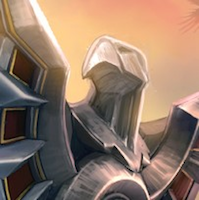
“Originally, we had the idea that there would be the main story, and then a dream sequence, or a flashback in memory,” says artist Ke “Keboom” Swaab. One particular drawing of Annie and her sister running through that dreamy landscape, a cross between an impressionist painting and stylized graphic design, captured the team’s imagination (another version of the scene made it into the League artbook).
“We could establish a unique style for memory, and different style for reality,” says Keboom.
But as the team continued to explore the two visual styles, the conversation shifted to combining them into one unified aesthetic for the whole animation. Keboom tried her hand at another piece of concept art to capture what that might look like.
The painting embodied everything they had been exploring. The team was in love. But when it came to its viability as a style for a full animation, they had their doubts.
“It’s very idealistic,” says Keboom. Incorporating both the aesthetic of the dream sequence—with its graphic, vibrant, and childlike lines—and the more photorealistic, carefully lighted reality of earlier explorations would be extremely tricky, if not totally impractical.
There was also the small problem of the team itself. It was unrealistic to think they could hand-paint every frame in this style—a task that would take hundreds of trained illustrators/animators—with a single-digit team that included exactly zero. “But we just loved the painterly, watercolor look,” says L i L i t a. They weren’t ready to give up just yet.
If the team wanted to make the mograph appear hand-painted with only a few hands to do it, they would have to work a little magic of their own—to create something that looked like a painting, but moved like an animation.
PYROTECHNICS AND FAIRY-TALE FIRE
“We needed to know how to make paint move, and we needed to know how to make fire, paint,” says RiotPastaBomb.
“I started by going to YouTube and picked a few fires,” says artist Jose “Come2Papa” Martin. He passed them through a filter in Adobe After Effects, trying various combinations of frame rate and brush sizes until the flickering flames began to (very roughly) approximate the look of paint.
Come2Papa continued to experiment with filtering to confirm how closely he could produce the particular style the team had come to refer to as “painterly.” It ended up working great—for about 80% of a given scene. What the filter couldn’t do was replicate that last 20%: the precise brushstrokes of a real artist and the key to making it look truly hand-painted.
“It can only apply the ‘brushstrokes’ arbitrarily,” explains L i L i t a. The filter reduced the total amount of manual labor required, but it would still be necessary to incorporate a step where the artists manually directed the motion on-screen rather than leave it random.
And some sequences would require more than just direction. While it was easy enough to pass a sourced video of rushing water through the filter and get a good foundation for a river environment, more specific sequences—like a burst of flame in the palm of a hand—required full 3D simulation before ever using the filter to render it in the 2D, painterly style.
The team’s solution was to develop a hybrid 2D/3D process, and with it, a new take on Annie’s pyrokinesis.
The newfound process was producing fantastic results when working with fire. Now it was time to test a full scene.
First, the team created an environment made from a composite image of still photographs. Then they added an illustration of Annie, color-corrected, and used the custom filter to produce the hand-painted, fairy-tale look. Finally, they manually added small touches to make it feel more three-dimensional: a combination of bigger and smaller brushes for the textures, shading and lighting.
It looked something like this:
“This test gave us confidence that we could achieve the style we wanted in the end, even with a team of only five people,” says RiotPastaBomb
But when it came to facial animation—critical for Annie to give an emotional and realistic “performance”—the team struggled hard.
THE DEVIL’S IN THE DETAILS
“First we tried motion capture, using those capture points to animate a 2D face,” says RiotPastaBomb.
Just as the filter was developed to make up for a lack of illustrators, motion capture would allow the team to animate without animators—or a third dimension. If the team could mirror (or at least mimic) muscles, they could work entirely in 2D. But it just didn’t look life-life, and in some cases, it was downright weird.
“Then we thought, maybe partial 3D?” says RiotPastaBomb. They tried mapping the 2D texture to a 3D “mannequin face,” keeping the animation mostly 2D, but venturing into 3D for key moments that required it.
But that had its own issues.
“It was so freaking difficult just to turn Annie’s face without it looking weird,” says RiotPastaBomb. “We’re talking five different assets. But, silver lining: We figured out how to do hair—which normally is very tricky in 3D—entirely as 2D assets, all done with distortion in After Effects.” Another silver lining: Annie’s dress ended up working like that as well.
The problem was that it was incredibly difficult to always animate Annie’s face the same way. “Because it wasn’t a true 3D model, where you have a single, actual geometry that will always be that way, every angle and every shift in lighting changed how things looked,” RiotPastaBomb explains. It was impossible to know how Annie should look from every viewpoint.
The team was torn. 3D would make everything “perfect” and establish consistency in the animation. But paint by nature is not a perfectly consistent medium; to look hand-painted, it would need to look somewhat imperfect.
In the end, the team decided on a mix of everything they had explored so far: 3D to achieve the initial consistency in animation, and 2D to capture the nuances of a painted image. The custom filter to produce a painterly foundation, and painting and shading by hand for the final details. A perfectly imperfect blend of the real and the fantastic—and one that was unmistakably made for Annie.
It’s taken months of exploration and a full year of storyboarding, 3D modeling, 2D texturing, filtering, cel shading, hand-painting, and animating to bring Annie’s origin to life. The tech has come a long way from login screens and the team has finished an animation that was as much a personal journey as an experiment in motion graphics.
But for Annie, it’s just her beginning.
For an extended inside look at the team’s process in action, check out the behind the scenes video.